In the previous assignment we’ve seen how conventional plot- and chart-types can be combined to convey information diagramatically. The various graphical building blocks you’ve cataloged have the advantage of being time-tested and leveraging the existing familiarity of the viewer with how to parse them. However this very familiarity can lead to a kind of disengagement with the content. Whether this is due to the visual samey-ness of ‘yet another pie chart’ or the rationalist framing of using ‘spreadsheet language’ to prove a point, plain-old charts & graphs are hardly the final word in communicating data visually.
In this assignment your challenge is to
reinvent an existing piece of information graphics (and the dataset it communicates) without relying on a computer to draw your final ‘graph’ or a screen to present it. By relating quantitative information to real-world objects, you have the opportunity to help your audience intuit relationships and magnitude through color and scale rather than simply seeing those values graphed.
Examples
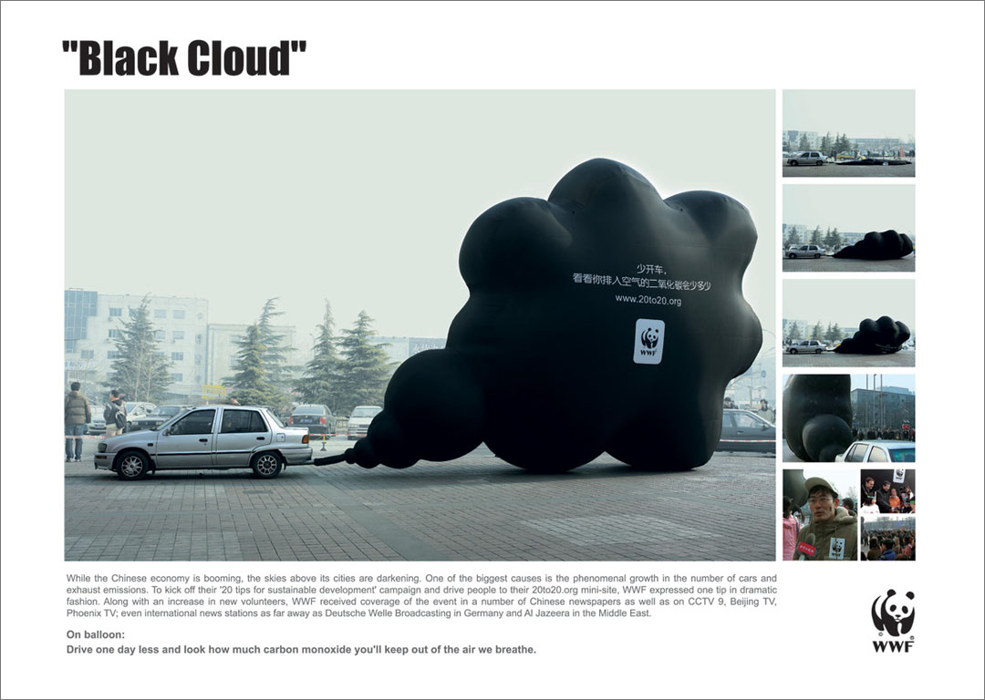
That cars pump out significant amounts of carbon monoxide is a fact we’re all familiar with, but the gas’s very invisibility keeps us from understanding this as anything but an abstraction. By making use of people’s experiences blowing up party balloons (and ramping up the scale significantly), this simple visualization of a day’s-worth of emissions speaks to us more viscerally:
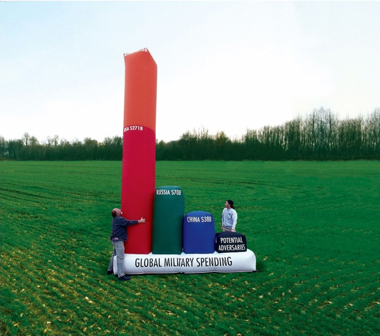
Similarly, the idea that the United States’s defense budget is wildly out of proportion to the rest of the world is something we ‘know’ but rarely ‘feel’. Stefan Sagmeister’s touring, inflatable graph is on one level ‘just’ a bar chart, but its use of real-world scale lets us get a sense of the magnitude using human-sized values we intrinsically understand.
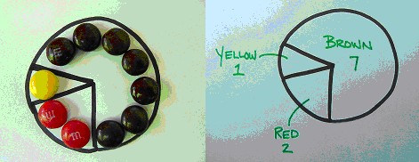
Other default chart types lend themselves well to physical representations. For instance, a pie or ‘waffle’ chart is functionally equivalent to a set of color-coded elements representing the same proportions:
Similar to a heatmap, 2D representations of common forms (such as geography) can be combined with an additional variable extruded into the third dimension. Using a screen-based approach, one could represent the differing population densities of Chicago through 3D renders...
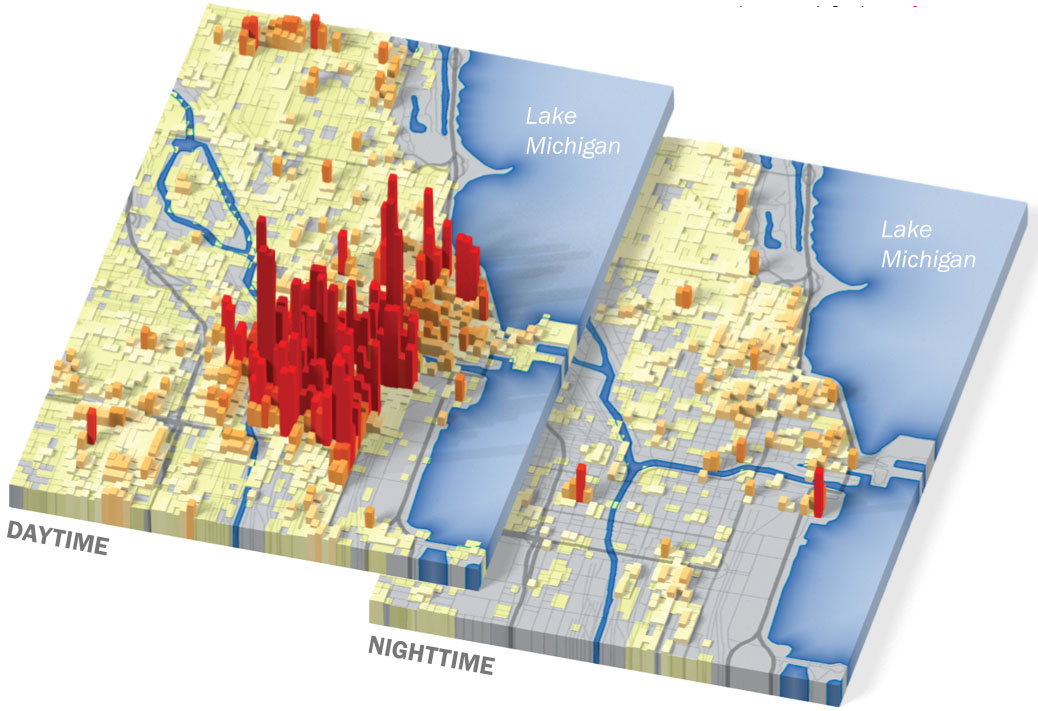
...but with the easy availability of laser-cutters and 3D printers, creating an ‘embodied’ version of this sort of topographical visualization is well within reach:

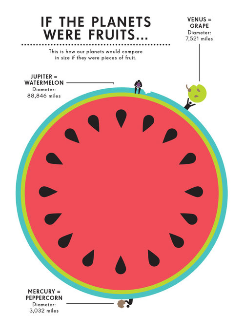
The relative sizes of incredibly large or small quantities can be communicated quite effectively through analogy to more familiar objects (where the problem of explanation boils down to one of unit-conversion). For example, Jennifer Daniel has related the sizes of our neighbors in the solar system to common fruits in her beautiful book on Space:
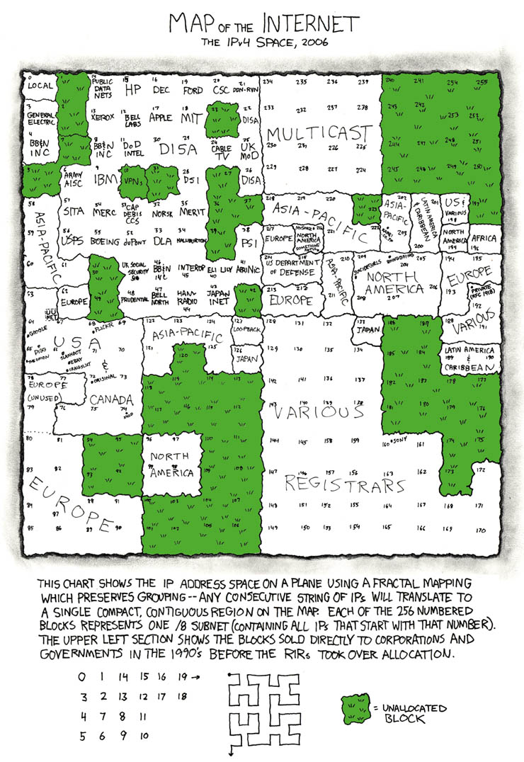
Randall Munroe has a long history of innovative and non-traditional visualizations in his XKCD comic. Here he represents the dwindling number of un-allocated IP addresses in terms of lawns and paved areas. Note the clever layout scheme that preserves locality while still arraying the different address ranges out linearly to fill the canvas:
Project
Your first task will be to choose a ‘source’ graphic from which you can extract the data you’ll need (or at least provides enough context for you find updated data through your own research). Pick a graphic with a form you think you can improve upon but with data that is accessible and a topic you find engaging.
You’ll notice that many of the most effective examples above are representing very modestly sized datasets (the exhaust balloon represents a single number, the planet-diameters only total up to nine values). So in picking a topic, think about what you want to say with it rather than how much information you can pack into it; less really is more in this case.
Over the next week, find a pair of source graphics and get started researching their context and collecting or extracting the raw data. For each topic, bring in three pencil sketches or wireframes illustrating different approaches to visualizing the information in the ‘real world’. In addition, bring in a spreadsheet with initial data for each.
Consider how you plan to construct these physical visualizations, how you will document the work, and what form the ‘final product’ is intended to take (e.g., the object itself, a photograph, a sculpture sited somewhere in Providence, etc.).
Sources
You’re free to choose any source diagrams/graphs/charts you like, but a terrific source of high quality data visualization can be found in the books of Edward Tufte. The library has copies of all of them, so try flipping through any/all of the following:
- The visual display of quantitative information (1983)
- Envisioning information (1990)
- Visual explanations (1997)
- Beautiful evidence (2006)
Also consider taking a look at these more eye-candy-oriented collections:
But again, keep in mind that your goal is to mine the source graphic for raw materials. Don't pick something because you like the way it looks/deals with the topic already. Pick something that gives you a topic you can work with and a graphical style you'll happily leave in the dust as you explore alternatives of your own devising!