A collective research project providing examples and discussion of the basic building blocks of visual data representation.
A Thousand Suns
For our first warm-up exercise, we'll be examining a simple time-series dataset: the history of nuclear testing by the eight (declared) nuclear nations. In the first phase of this project we will consider only the total number of test explosions across two dimensions:
- the state conducting the test
- the year in which it occurred
Despite the simplicity of the data, there are a number of ways to slice and group the data. Some things to consider:
- Is each year plotted separately, or are the totals grouped into decades or some other multi-year chunk
- Is time represented by position on the x or y axis? Or by angle? Or using color?
- What are the 'objects' being represented in your diagram? Are they the countries, the years, or the individual tests?
- How will your diagram address the 'lull' that resulted from the Comprehensive Test Ban Treaty in ’96 and the more recent resurgence in testing?
Getting started
Begin your investigation with this simplified dataset collected from the Natural Resources Defense Council's pages on the original and subcontinental nuclear powers.
Download a copy of arms-race.zip which contains JSON & CSV versions of the table below (plus a PlotDevice template script to get started with). This script builds on our work learning the drawing primitives in three major ways:
- setting drawing parameters with structured data rather than hard-coded values
- working with serialized JSON data
- using loops to render multiple ‘instances’ (a.k.a. rows) of a data set using the same procedure each time
Start by modifying the code in the render.pv script and explore some of the different ways to represent the country, year, and test-count values. Make 'snapshot' copies of your script as you modify it so you can build up an array of different approaches.
Next steps
Over the next week, continue working with this dataset and sketch out three different approaches to representing it in a way that tells a story.
Confine yourself to static, non-interactive representations for now, but consider any medium that could represent these values; posters, projections, and physical representations are all just as valid as pixels on a screen.
In at least one of your three variations, bring in one additional variable using data you find on the web and be sure to cite your source. This additional variable could be anything from a timeline of world events to the military budgets of the countries (or even the astrological signs of their leaders). Just make sure you can defend how it is in some way adding useful context to the data.
Feel free to use whatever tools you're comfortable with. Programmatic drawing can be very handy but so can Excel…
Data sources
This spreadsheet on Google Docs has a tidied up copy of the NRDC data and provides both the total number of tests as well as distinguishing between 'atmospheric' or 'underground' tests.
Also consider taking a look at the Wikipedia page listing the various tests and providing links to country-specific pages with background information about the individual tests.
For geographical data, take a look at the materials collected by the Johnstons Archive. But keep in mind that using a map opens quite a few cans of worms, so be sure to have a clear idea of what you're trying to communicate before diving in...
Uncharted
In the previous assignment we’ve seen how conventional plots and chart-types can be combined to convey information diagramatically. The various graphical building blocks you’ve cataloged have the advantage of being time-tested and leveraging the existing familiarity of the viewer with how to parse them. However this very familiarity can lead to a kind of disengagement with the content. Whether this is due to the visual samey-ness of ‘yet another pie chart’ or the rationalist framing of using ‘spreadsheet language’ to prove a point, plain-old charts & graphs are hardly the final word in communicating data visually.
In this assignment your challenge is to represent a small dataset of your choosing without relying on a computer to draw your ‘graph’ or a screen to present it. By relating quantitative information to real-world objects, you have the opportunity to help your audience intuit relationships and magnitude through color and scale rather than simply seeing those values graphed.
Examples
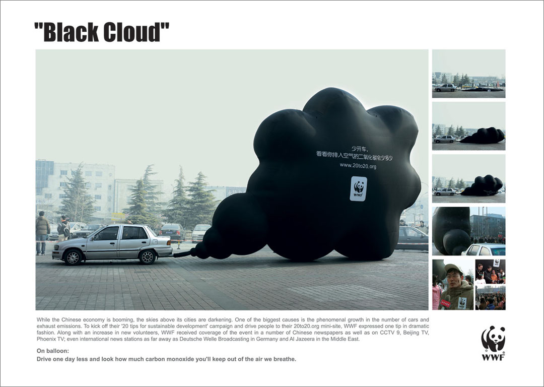
That cars pump out significant amounts of carbon monoxide is a fact we’re all familiar with, but the gas’s very invisibility keeps us from understanding this as anything but an abstraction. By making use of people’s experiences blowing up party balloons (and ramping up the scale significantly), this simple visualization of a day’s-worth of emissions speaks to us more viscerally:
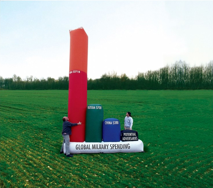
Similarly, the idea that the United States’s defense budget is wildly out of proportion to the rest of the world is something we ‘know’ but rarely ‘feel’. Stefan Sagmeister’s touring, inflatable graph is on one level ‘just’ a bar chart, but its use of real-world scale lets us get a sense of the magnitude using human-sized values we intrinsically understand.
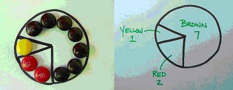
Other default chart types lend themselves well to physical representations. For instance, a pie or ‘waffle’ chart is functionally equivalent to a set of color-coded elements representing the same proportions:
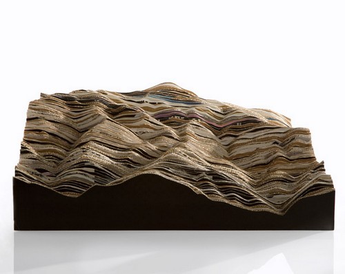
Similar to a heatmap, 2D representations of common forms (such as geography) can be combined with an additional variable extruded into the third dimension. Using a screen-based approach, one could represent the differing population densities of Chicago through 3D renders...
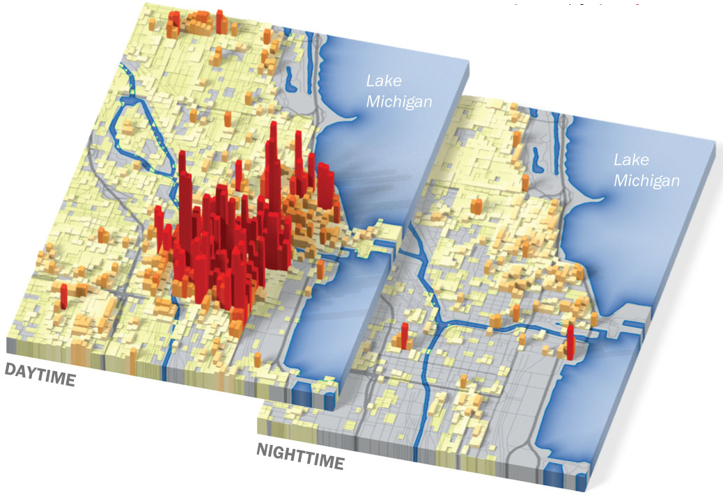
...but with the easy availability of laser-cutters and 3D printers, creating an ‘embodied’ version of this sort of topographical visualization is well within reach:
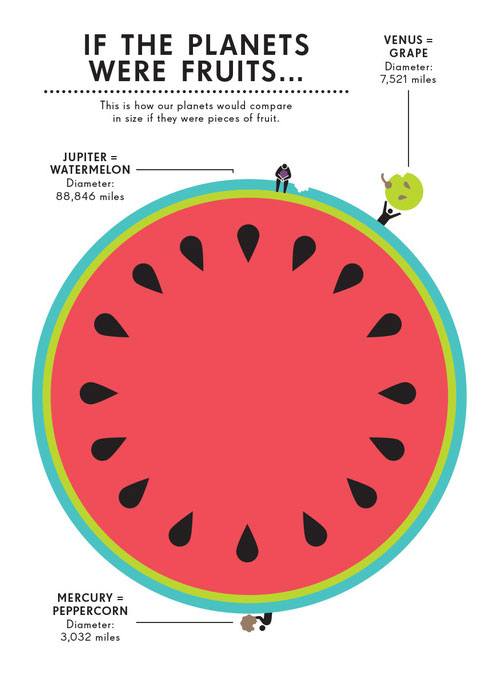
The relative sizes of incredibly large or small quantities can be communicated quite effectively through analogy to more familiar objects (where the problem of explanation boils down to one of unit-conversion). For example, Jennifer Daniel has related the sizes of our neighbors in the solar system to common fruits in her beautiful book on Space:
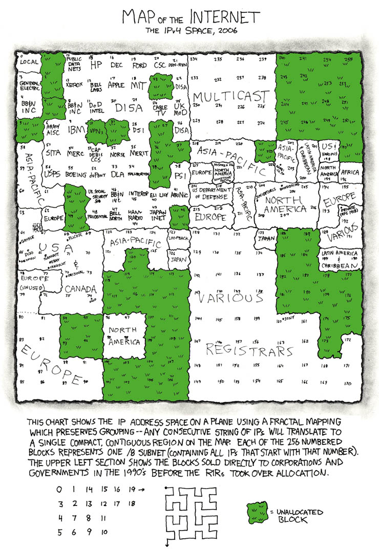
Randall Munroe has a long history of innovative and non-traditional visualizations in his XKCD comic. Here he represents the dwindling number of un-allocated IP addresses in terms of lawns and paved areas. Note the clever layout scheme that preserves locality while still arraying the different address ranges out linearly to fill the canvas:
Project (week 1)
Your first task will be to choose a topic and locate a data source that allows you to engage with it. You’ll notice that many of the most effective examples above are representing very modestly sized datasets (the exhaust balloon represents a single number, the planet-diameters only total up to nine values). So in picking a topic, think about what you want to say with it rather than how much information you can pack into it; less really is more in this case.
Over the break, come up with a pair of topic ideas and get started collecting data along those lines. For each topic, bring in three pencil sketches or wireframes illustrating different approaches to visualizing the information in the ‘real world’. Consider how you plan to construct these physical visualizations, how you will document the work, and what form the ‘final product’ is intended to take (e.g., the object itself, a photograph, a sculpture sited somewhere in Providence, etc.).
Free Form
Our previous assignments have been characterized by either the data or the form being pre-determined. In this final visualization project you will choose both the subject matter and the ‘rules’ by which it will be visually represented.
Your projects should draw on both the standard language of information graphics used in your early assignments and the physically-embodied representations you have developed more recently. The key is let the data determine the spatial, spectral, or aural characteristics of your visualization.
First steps
In week 1 of this assignment, you are to come up with three potential topics. For each topic, bring to class:
- a testable question that you will try to answer through your investigation of the data
- rough pencil sketches of how you intend to graphically depict the data
- links to potential data sources
The data you choose for this assignment could be based on your own empirical measurements, but there is a wealth of pre-formatted data available to you in various places on the net. As you research your topics, try adding the word ‘database’ to the end of your search query; you may be surprised at what’s already out there.
For instance, here are some interesting places to start poking around:
The Guardian’s spreadsheet collection
RISD Annual Summary PDFs
The CIA World Factbook
Thomas Pikketty’s economic data
Providence OpenData
NYC OpenData
Gapminder raw data