HEAT MAP
a graphical representation of data where the values contained in a matrix are represented as colors.
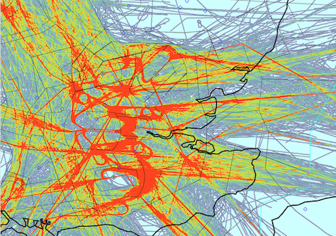
Can be used for understanding behaviors on multiple scales: digital, built environment, geography
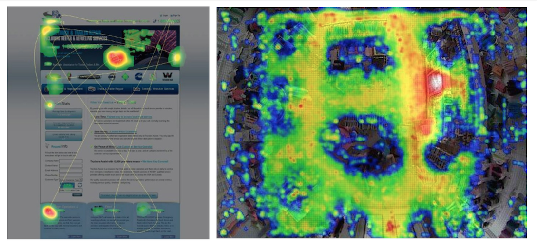
 UI/UX,
shopping,
air traffic
UI/UX,
shopping,
air traffic
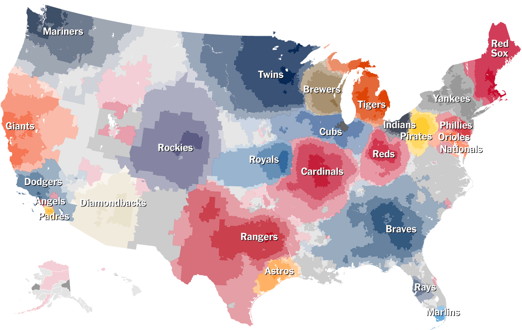
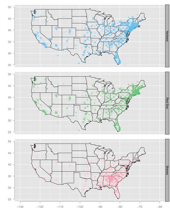
Incorporating Interests with Geopgraphy: NYT Geography of baseball fandom
Facebook Distribution of baseball team fans
 facebook
COMPARISON: These two heat map examples depict data gather from facebook about where baseball team fans are geographically located. The two visuals serve different purposes. The NYTs is focusing on the transitions between large team territories as compared to Facebook's visualization of team fan distribution across the country. Regardless of intent, I find the NYT graphic to be richer in content and use the heat map technique to greater effect.
BAD EXAMPLE: Reddit Interest Network
This infographic depicting the frequency of subreddits with the frequent re-posting in red and the less frequent in blue.
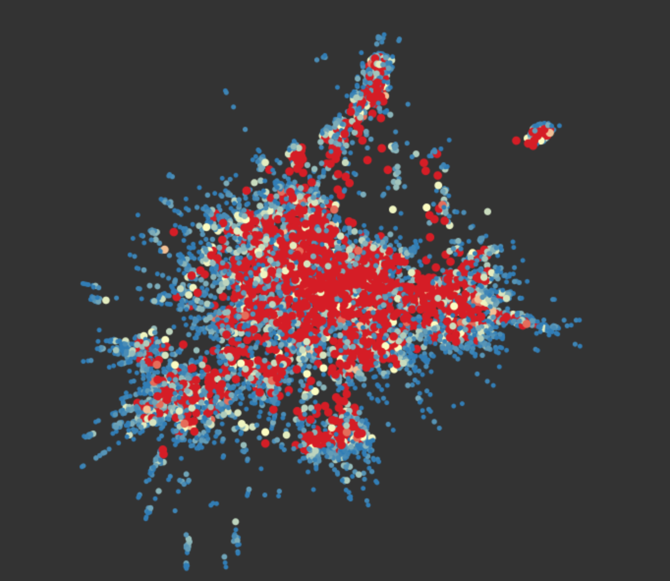
This graph highlights the importance of having a known geography to map information on.
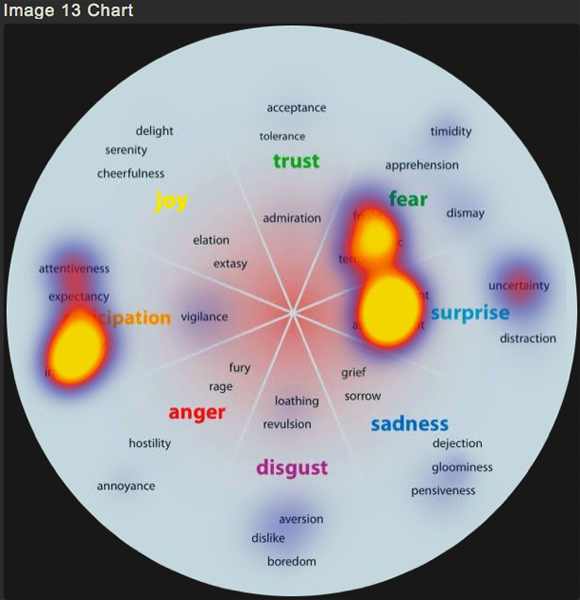
BAD EXAMPLE: Understanding What Emotions Goes Viral for Marketing Campaigns