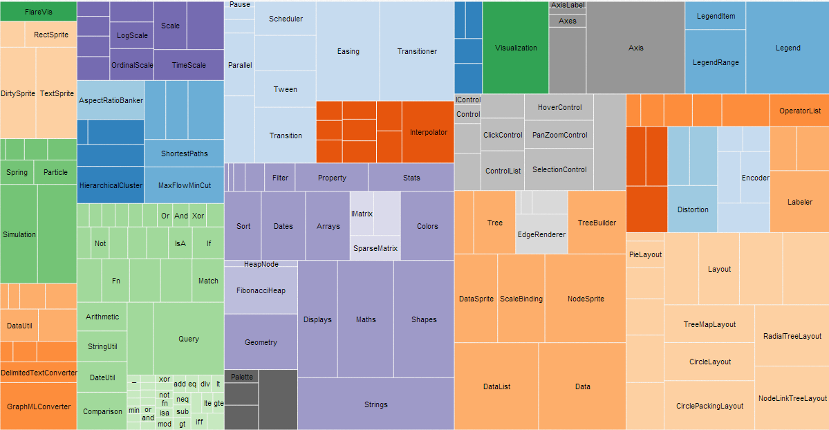
Tree Maps
A tree map is an area-based visualization for a hierarchically-ordered (tree-structured) set of data. It is presented as nested rectangles whose relative size and color each convey a dimension of the data.
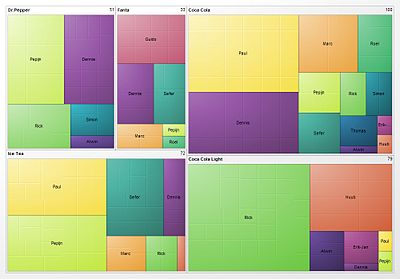
Here is a visualization of soft drink preferences across a set of people.
 Source: Wikipedia
Tree maps are good for quickly seeing whether or not there is a pattern between two dimensions of a data set. The tetris-like geometry also makes Treemapping good for displaying especially large sets in one view.
Creating a tree map involves choosing two dimensions of the data, color-coding one dimension and defining a "tiling algorithm" for the dimension represented by area. The tiling algorithm determines how the rectangles are sub-divided into rectangles of specific area (corresponding to the data). Tree maps are most legible when the area of sub-rectangles have an aspect ratio close to one.
While not the most beautiful example, the following tree map of greenhouse gas emissions by buildings on the campus of the University of North Carolina at Chapel Hill, shows what is meant by "sub-rectangles".
 Source: blogs.sas.com
Another good example, and description of how to read it:

"For UNAIDS (the Joint United Nations Programme on HIV/AIDS), Michael Lindsay of studiovertex designed a pair of treemaps that detail the prevalence of HIV worldwide. The first treemap (left side of the above) visualizes the status of those living with HIV (new infections vs. fatalities; those receiving treatment vs. those waiting for treatment). The second treemap (right side) depicts the geographic regions where those with HIV live, drawing attention to the disproportionate incidence of HIV in Sub-Saharan Africa and Asia as compared to the United States and Western Europe." (Source: arcadenw.org)
Bad example 1:
 Ungrouped colors make it hard to compare area
Bad example 2:
 Unlabeled groupings with no key