Survey Plot / Table Lens
Popularized in the "Table Lens" project from Xerox, these resemble series of bar graphs that can be sorted independently.
What is a survey plot?
We present a new visualization, called the Table Lens, for visualizing and making sense of large tables...The Table Lens fuses
symbolic and graphical representations into a single coherent
view that can be fluidly adjusted by the user. This fusion and
interactivity enables an extremely rich and natural style of
direct manipulation exploratory data analysis. — Table Lens
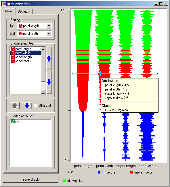
A survey plot is a simple multi-attribute visualization technique that can help to spot correlations between any two variables especially when the data is sorted according to a particular dimension. Each horizontal splice in a plot corresponds to a particular data instance. The data on a specific attribute is shown in a single column, where the length of the line corresponds to the dimensional value. When data includes a discrete or continuous class, the slices (data instances) are colored correspondingly. via Orange

What is it for?
Survey plots can be useful in data analysis to quickly find correlations and patterns in large amounts of data. Not so great if you want to see individual values, it's more of a "bigger pictures" graphing technique.
Compresses larges quantities of data into an easily digested visual. For example, a baseball statistics table contains 323 rows by 24 columns = 7429 cells total which would not fit onto a standard screen. However using the table lens, you could easily display all the data with more room to spare (see below).
