Star Plots ⭐️
Star plots, sometimes called radar charts or web charts, are a graphic device method used to display multivariate data. Multivariate in this sense refers to the having of multiple characteristics to observe. The variables must also be ranged values.
Star plots are often used to display several different observations of the same type of data. For example, this set of star plots compares different car models in the same nine variables:

- Price
- Mileage (MPG)
- 1978 Repair Record (1 = Worst, 5 = Best)
- 1977 Repair Record (1 = Worst, 5 = Best)
- Headroom
- Rear Seat Room
- Trunk Space
- Weight
- Length
Like many other star plots, labeling variables on the chart can be convoluting, so the variables are listed seperately above. In this set of plots, we can see that Cadillacs are the most expensive cars of the observed values.
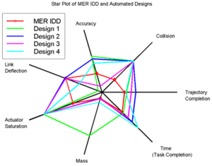
This method of comparing similar items can be done on the same plot (rather than on separate axes) using different colors or line styles, as in the following. This method makes it easy to compare one observation to another, but can become difficult to read with a larger number of observations. Here, we can easily see that Design 1 (in green) has a strong dominance in mass, or an outlier.
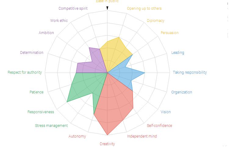
A popular presentation of this data visualization method is in "personality type" analysis tests. Typically, there is no relationship between the placement of variables, but this chart made use of this spatial technique and grouped personality variables that are commonly related, into five groups, indicated by color:
The star plot is useful in answering three major questions:
- Which variables, if any, are dominant (or lacking) in a given observation?
- What observations are similar? (i.e. Are there any trends between some or all observations?)
- Are there any observations that are outliers?
It can also be used to show changes between discrete periods of time. The following graphic compares revenue of companies between two years. The years are marked as different observations by colored lines.

Note how this display is much easier to cognitively process than trying to mentally calculate differences in a tabular chart as in below.

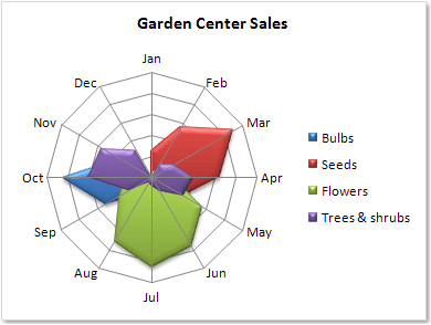
Conversely, one can display the variables (the axes) as discrete times as well. The following graphic compares item stock by line/observations and labels the months as variables.
The main weakness of star plots is that they are limited to displaying a few variables at a time (practically speaking, no more than 20, but there are some that are as large as up to 100 variables). After that, the web becomes overwhelming or extremely large. The plot below is difficult to understand because of its sheer number of variables, obscurely labeled variables, and bad color choice (two types of blue for very similar observations).
