Scatter Plot- The Good, The Bad, and The Ugly
The Good
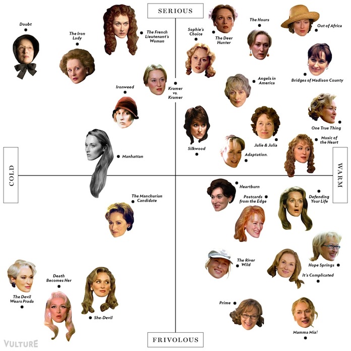
Other than being just funny, I think this scatter plot is working because the points/faces are relational to create understanding versus being associated solely to the axis.
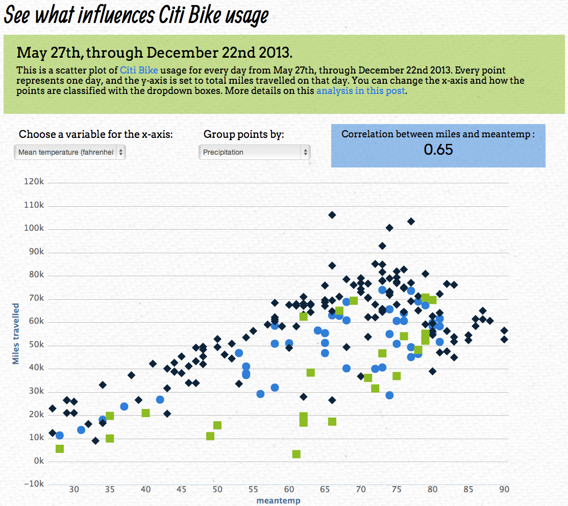
This plot is addressing the magnitude with different colors and shapes which creates more clarity in my opinion.
 http://linkit.kr/charts/assets/images/samples/nvd3/2.png
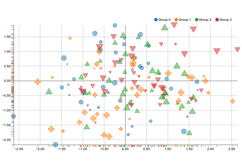
This plot is working similarly to the previous plot in that way as well.
 http://coffeespoons.me/wp-content/uploads/2015/05/scatterPlot.png
The Bad
 http://coffeespoons.me/wp-content/uploads/2015/05/scatterPlot.png
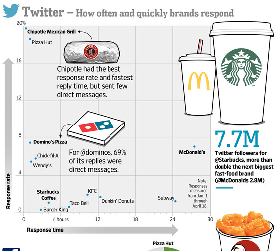
This plot has a lot of variables, while it isn't terrible, I think that because some companies are highlighted and for different characteristics, it is minimizing the readability for the facts that are presented.
 https://datavizblog.files.wordpress.com/2013/11/scatterplot-measuring-metrics.jpg
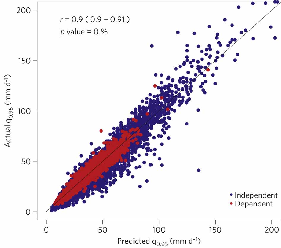
This has the same issues. While the info may have translated into this graphic without intention, the lack of data (too large a gap in the axis increments) makes it too vague to follow.
 http://www.nature.com/nclimate/journal/v2/n7/images/nclimate1497-f3.jpg
The overlap in this graphic is distracting but it might be okay.
The Ugly
 http://1.bp.blogspot.com/-OQxk_34rwT8/Ta4aJ0MYBRI/AAAAAAAAAVc/43EPPYdx5uI/s1600/scatterplot.gif
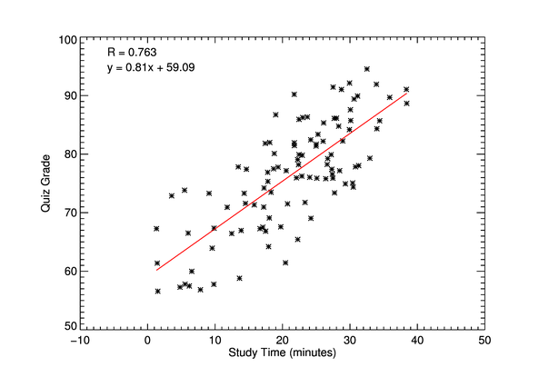 http://www.idlcoyote.com/cgtips/scatter2d1.png
Synthesis:
Scatter Plots have the ability to display large amounts of data in a small field to visualize a potential trend. However, in my naïve opinion, they also seem to leave too much room for inaccuracy. Visually it can be hard to see where points would fall compared to the axis lines and when data overlaps, information gets lots. Some of the better scatter plots are addressing this with different symbols and colors but I still believe it is confusing. Scatter plots can easily become ugly too because their success is related to their simplicity (or really well made graphic design).