Pretty good example:
The first map shows urban transit systems in North America. The map covers a continental space, so it is easy to compare size of transit systems of North America's largest cities. Mexico City and New York City's maps are much more compact and entangled, whereas San Francisco's system is made up of less lines but longer and less compact.
Also good example:
http://darksitefinder.com/maps/world.html
the third is an interactive world map of light usage
Not a very good example:
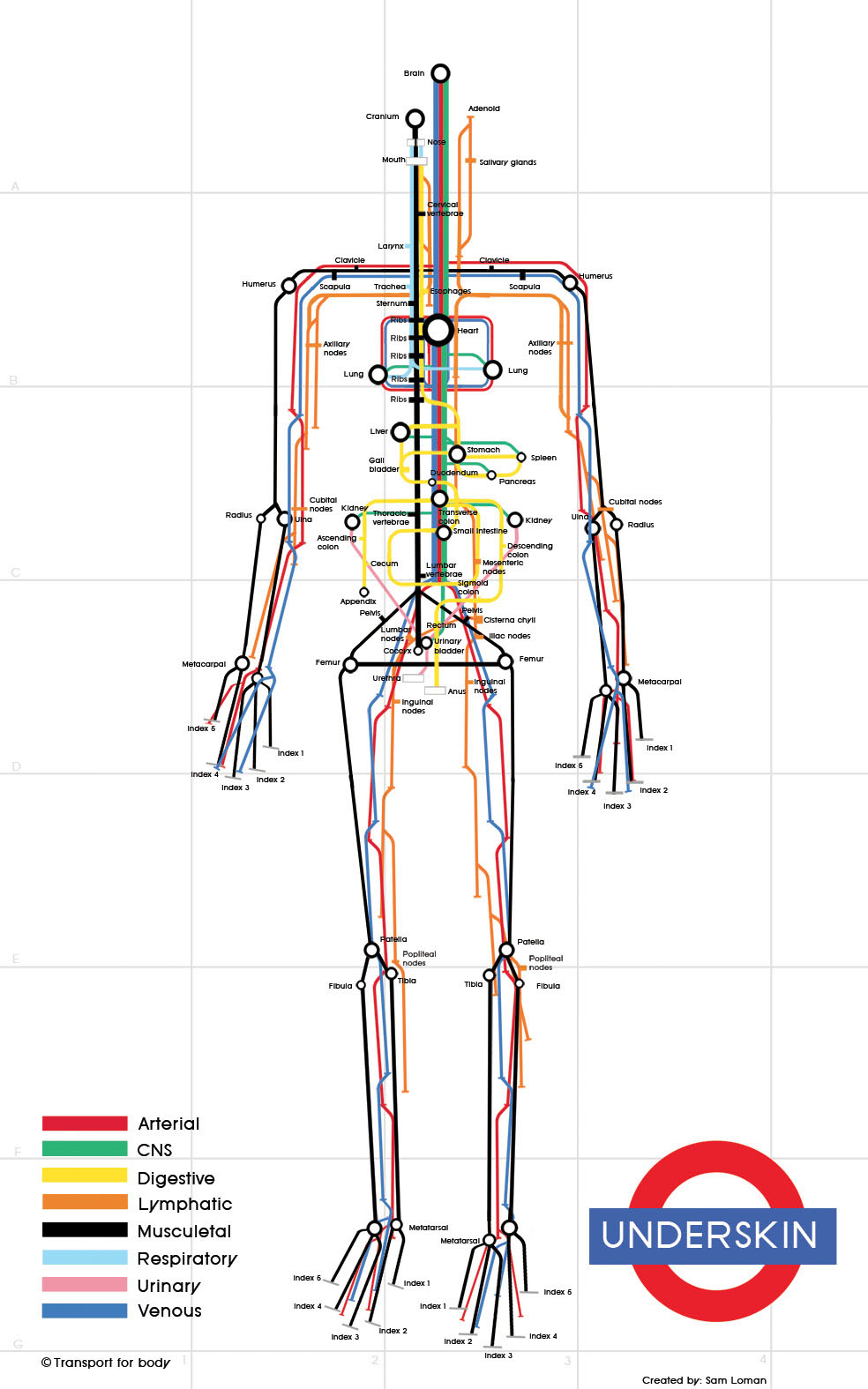
The second map traces 8 different systems of the human body in a subway-like format. The colors of the different systems in the body help visualize the different routes within the body; however, the map oversimplifies the entire system of the body, making each system seem to be separate and distinct. It also downplays the human body's physical complexity.
not so good map:
https://blog.twitter.com/2013/the-geography-of-tweets

Interesting to see the usage of social media on a map and the comparisons between different cities, but the map was only of geotagged tweets and also public tweets, so data can be misleading. I really like being able to see this data on a detailed geographical map, but what is the importance of tracking tweets.