Histogram
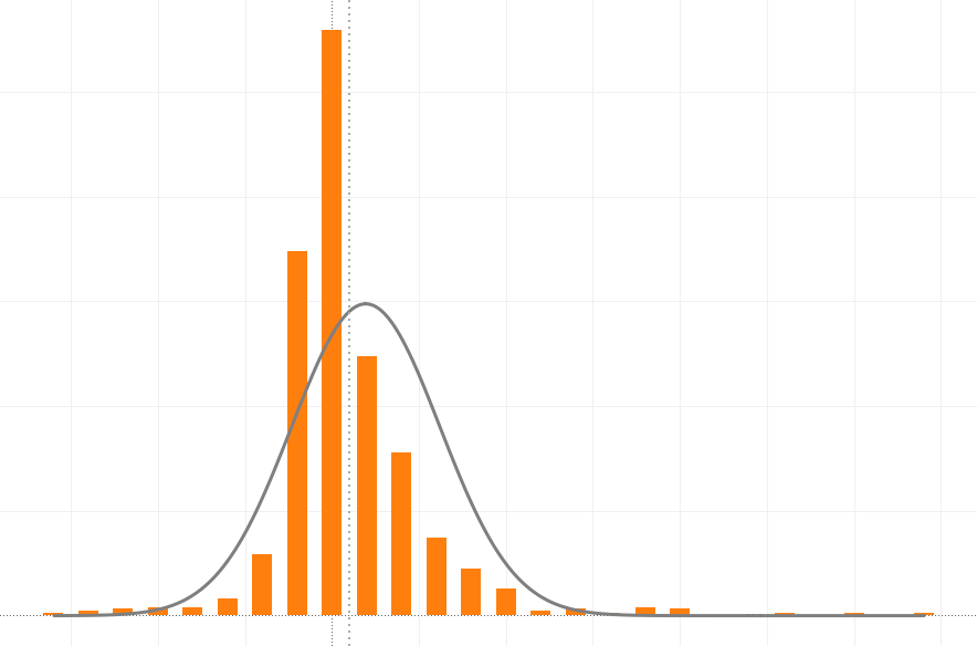
Histogram is a graphical representation of the distribution of numerical data. It is similar to a Bar Chart, but a histogram groups numbers into ranges, and one decides what ranges to use. It's particularly useful when there are a large number of observations.
Example:
Photography Histogram
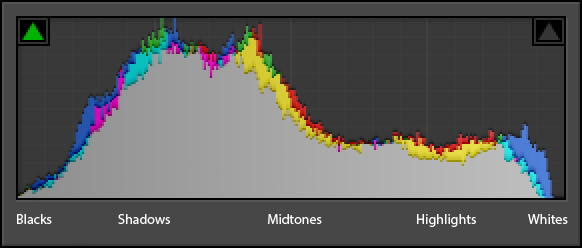
A photography histogram is a graphical representation of the pixels exposed in your image. The left side of the graph represents the blacks or shadows, the right side represents the highlights or bright areas and the middle section is mid-tones (middle or 18% grey). How high the peaks reach represent the number of pixels in that particular tone. Each tone from 0-255 (0 being black and 255 being white) is one pixel wide on the graph, so imagine the histogram as a bar graph all squished together with no spaces between each bar.
Manipulating Histogram
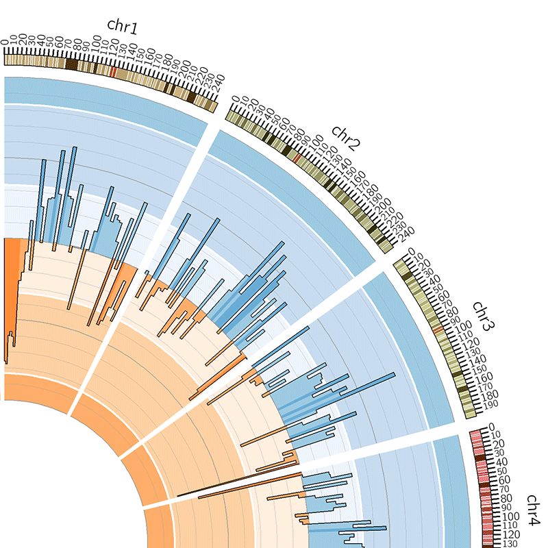
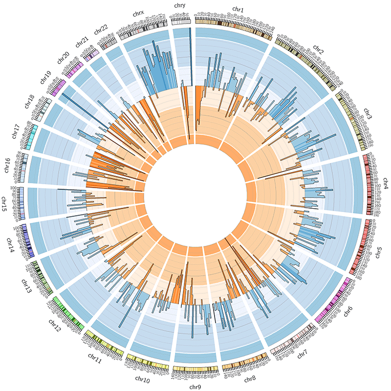
A histogram also can be manipulated and become more complex.
Bad Example:
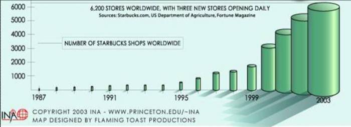
This visualization example is taken from International Networks Archive of Princeton University, a research center of the mapping of Globalization. In this case, the 3-Domain histogram shows the number of Starbucks shops worldwide, which is increasing dramatically in the recent 20 years. Yet the third dimension of the histogram is unnecessary. According to the encoding rules, univariate data should use 2-Domain plot. For example, according to the exact number of Starbuck shops in 1996 and 2003, the volume of the cylinder of the former should be 1/6 of the later, which is much smaller than the actual cylinder of 2003. Also, the shade of the cylinder is confusing.
Also, when the ranges of the graphs are too broad, it's difficult to compare or can fail giving information.