Heat Maps
Heat maps are graphic representations of data where individual values are color coded in a matrix. Values are often integers but may be a range of different values including locations, percentages, fractions etc. Heat maps are useful for comparing trends or patterns of similar or differing conditions. They can also help to visualize a catalogue of information that may be difficult to understand in real time. They allow for a matrix to be created which helps with organization, but can also create boundaries that may not exist.
GOOD Examples
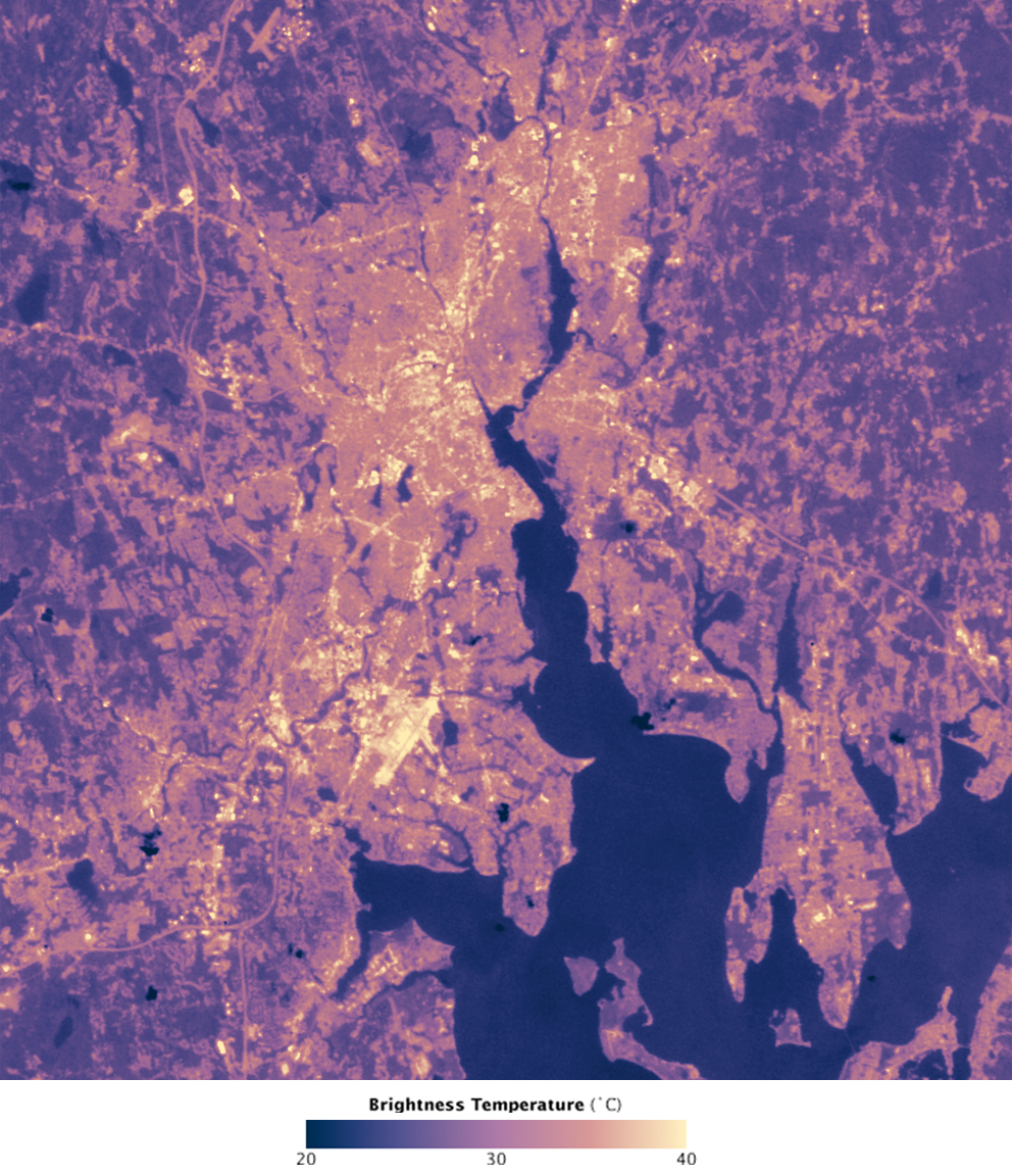
Urban Heat Islands
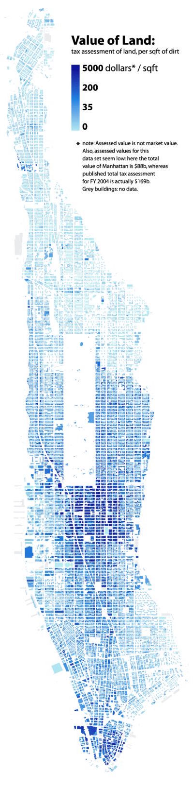
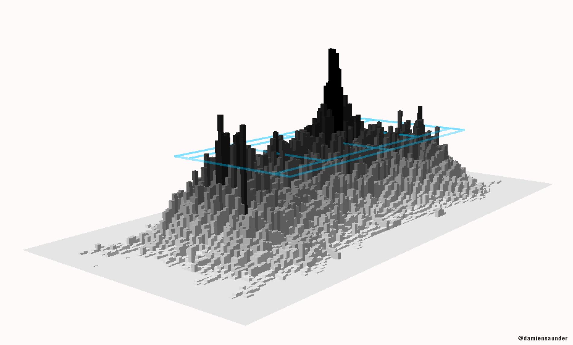
New York City Land Values ($/Squarefoot)
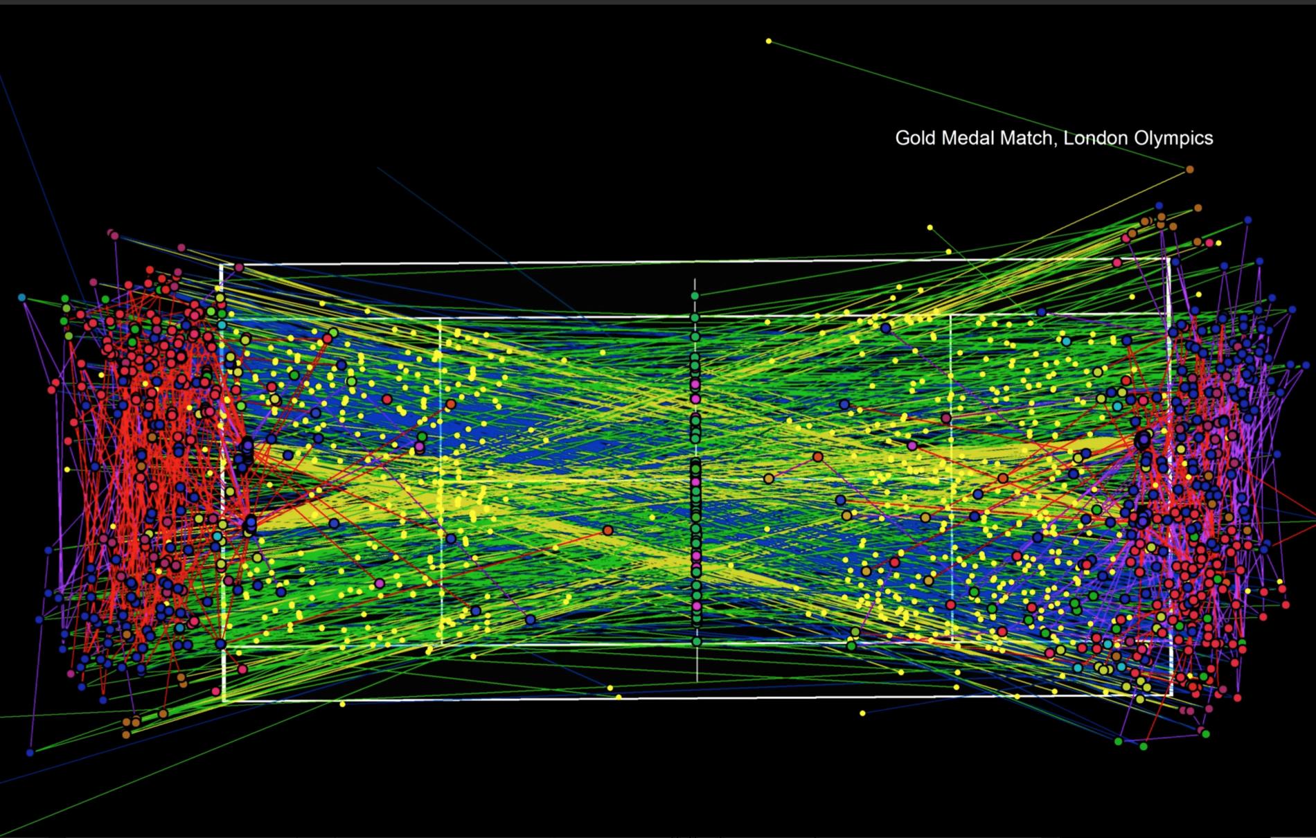
A three-dimensional "heat map" that shows the frequency of ball movement on the court.
BAD Examples
Bounces and racket strikes of every ball in the 2012 Olympic gold medal match between Roger Federer and Andy Murray.
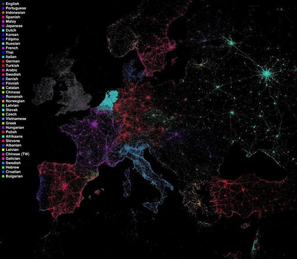
Languages Spoken Throughout Europe
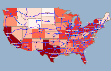
USA State Heat Map
Sources:
https://svs.gsfc.nasa.gov/10699
http://www.radicalcartography.net/index.html?manhattan-value
http://news.nationalgeographic.com/2015/09/150906-data-points-tennis-tracking/
https://flowingdata.com/tag/eric-fischer/
http://www.alignstar.com/support/clients/webhelpv6/Tipsforcreatinggoodthematic_maps.htm